@bender@twtxt.net Cool 😎
@bender@twtxt.net I guess if you’re going to support the choice of Bulma (and the reason for this Yarn in the first place is I’m pretty rubbish when it comes to UI/UX, so I need all the help I can get! 🤣) – You need to help me understand; Is Bulma a better choice because you see “components” it has that may be useful in a new (say) Yarn 2.0? Or is Picnic CSS enough? 🤔
@bender@twtxt.net @mckinley@twtxt.net If you had to pick between Picnic CSS and Bulma? Which would you choose? 🤔 And why?
Do we have another crack at a Twtxt <-> ActivityPub service?
So… What does a lightweight yarnd 2.0 even look like? Hmm 🧐
Whoo! 😳 We run 5-0 (games) tonight in table-tennis 🎾 My tam mate also won her 2 singles for the first time! 😅 Whoohoo!
@aelaraji@aelaraji.com Like deebs.net

🤔
Wow three different opinions 🤣
@movq@www.uninformativ.de ahahahahah 🤣🤣🤣
@shreyan@twtxt.net True! And I agree 👌
I’m not sure what the plans are anymore 😢 I still love the simplicity of Twtxt too and I’ve always seen this project as more of an “ecosystem”.
Appreciate the positive kind words, but you’re right, “momentum” has died a lot and I don’t have as much spare time or energy as I used to.
@bender@twtxt.net Ouch! 🤣 Was/Is it worth it? 🤔
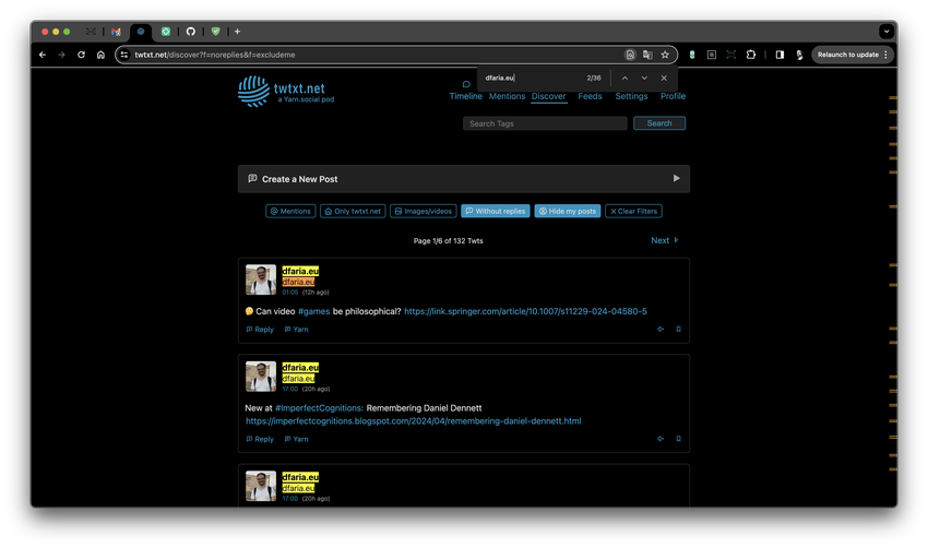
36/2 = 18 at 25 Twts per page, that's about ~72% of the search/view real estate you're taking up! wow 🤩 -- I'd be very interested to hear what ideas you have to improve this? Those search filters were created so you could sift through either your own Timeline or the Discover view easily.
@aelaraji@aelaraji.com Yup! And to be fair to @dfaria@twtxt.net this is a general problem.
That only works if you’re a user of said pod right? 🤔 Is this going to be the majority of cases or do we have to also worry about anonymous users (and crawlers/bots) where the “Discover” view is essentially the pods front page?
Of the following CSS libraries, which is more appealing to you? 🤔
Maybe some kind of option that when enabled will collapse multiple posts from the same feed and only show the top most recent one, with some kind of UI/UX that indicate “N more today…”?
Is Yarn.social dead or just too niche? (uyrrria) 🧐
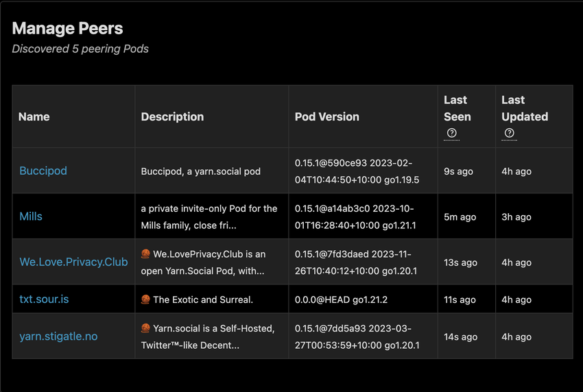
I’d also be very interested to hear what some other users of yarnd have to say, sadly there are only a handful of pods around that I’m aware of and/or that peer with my pod (twtxt.net) 😢

Maybe Yarn.social/Twtxt has become boring or too niche? 🤔 Anyway cc @eldersnake@yarn.andrewjvpowell.com @xuu@txt.sour.is @stigatle@yarn.stigatle.no @abucci@anthony.buc.ci
Another feature as mentioned in #iq4rusa is using filters on the Timeline and/or Discover views. One of the most common “workflows” I use is to go to “Discover” and use the “Without replies” and “Hide my posts” filters to see if there’s anything new and interesting in my pod’s cache I haven’t seen before or maybe could reply to (or not).
Of course as I’ve locked down registrations on my pod anyway (have kept it locked down now for months) due to SPAM accounts and bots just creating rubbish accounts/feeds, this workflow may no longer be all that useful? hmmm 🧐
Hah 🤣 @dfaria@twtxt.net Your @dfaria.eu@dfaria.eu feed really does consume about >50% of a “Discover” search with filters “Without replies” and “Hide my posts”. 🤣

36/2 = 18 at 25 Twts per page, that’s about ~72% of the search/view real estate you’re taking up! wow 🤩 – I’d be very interested to hear what ideas you have to improve this? Those search filters were created so you could sift through either your own Timeline or the Discover view easily.
One thing to be clear about here is that it was never my intention for a pod’s “front page” (Discover view when not logged in) to be any kind of “listing” or “advertising” or such. That was completely unintentional. If this is expected somehow, we should probably discuss that too more seriously and discuss its merits, and if it can be support, should be supported, or if there’s a different solution entirely? For example. there is the search engine which could show a global feed/timeline view, albeit the domain could be something different.
I’d like to hear some ideas that fix or improve the signal / noise ratio for all users and even benefits non-users (anonymous users just hitting a pod’s index page, which is the discover view)
There’s also a pod-level setting (admins) that control what the “Discover” (or front page if you’re not logged in) display:

This is either:
- Local posts only (local to the pod)
- All posts in the pod’s cache
One of the problems I have with changing the way the “Discover” view works whilst at the same time keeping it “clean” (depending on who you talk to) is the behaviour between “Timeline” (what you follow explicitly) and “Discover” (a view into the pod’s cache). See attached, where I by default prefer a “collapsed” view (hiding replies). The default behaviour for Discover (no controls) is “everything”.

The reason I bring this up is that part of my “workflow” has become to occasionally use the “Discover” view to see if I’ve missed any “in-between” replies that often happen, find new interesting folks to follow and/or interact with, etc.
Changing this to anything but the current behaviour would break this flow for me 😢
@bender@twtxt.net Nah feeling pretty rubbish today actually 😢
@marcorocco@roccodrom.de What are you updating and changing out in your bathroom? 🤔 We probably need to update our bathroom too, the spa pipes are getting a bit uggh 😅
@aelaraji@aelaraji.com I just woke up fianally 🤣 It’s 12:45pm here (midday)
@bender@twtxt.net Haha I know and @lyse@lyse.isobeef.org is awesome🤣
@dfaria@twtxt.net Appreciate this 👌 Right now the algorithm is quite dumb – and I’d also hate to develop any algorithm that abuses any data from users. So definately needs to be things like:
- one post per day per domain
- or latest post per domain
etc/./
@sorenpeter@darch.dk Yup! Some good simple ideas there 👌
@sorenpeter@darch.dk Thanks for your positivity and support ! 🤗 This is exaxrly spot on, however I also realize getting things “right” is actually quite hard 😅
-run flag for go test to specify only one area of tests to be executed. Much more fun this way to quickly go back to writing code.
@lyse@lyse.isobeef.org How much emphasis do you place on test coverage?
To be fair cleaning up “noise” is quite hard to do. Obciously all the 1-way Mastodon feeds were easy because there’s just no way to interact with them!
@dfaria@twtxt.net That’s fair. Also removed the block on your domain btw.
@bender@twtxt.net I guess all I can do is unblock the domain and sit down and rethink the “Discover” view’s design and behavior? hmmm 🧐 Alternatively, build a new yarnd 2.0? as a single-user pod only?
@bender@twtxt.net Yeah I could get behind that. Define minimalistic though? What features (if any) would we drop? Would it be mobile-first or desktop-first?
@bender@twtxt.net I couldn’t agree more 🤣
@bender@twtxt.net I never see problems on my end, so I suspect this has to be Cloudflare doing this occasionally. I’ll have to poke around there again. At least I have a close enough timestamp :D Maybe message me your IP and approximate timestamp?
I think multi-user pods were a mistake.
@dfaria@twtxt.net Sorry this has pissed you off so much (unintentional) – Also why the irrational outburst?! 😱 That’s no way to have discourse or help improve anything 🤦♂️
If you have ideas for improvement we’re all ears 👂
@dfaria@twtxt.net Cancelling is a strong word. I’d you follow your other feed yourself it’s still visible to you!
This whole exercise just reenforces that the idea of the “Discover” view was and is a terrible idea. 😢
We’ll have to see how this policy will be implemented, but I like that Gentoo is willing to take a stand.
Me too😅
@movq@www.uninformativ.de Haha 🤣 I saw this too and immediately thought
I have to stop using Terraform
🤣
@bender@twtxt.net Oh my 😱
@mckinley@twtxt.net I’m not sure to be honest I think it’s just a straight up duplicate post. This actually does happen, it’s not a bug, it’s a “human problem”, but yeah it’s annoying, so it’s making me want to figure out a way of keeping some kind of similarity db to strip duplicates out like this.
Hmmm the feeds service needs some kind of deduping 🤔 Slashdot seems to be the most frequent culprit 🙄 For example #oc2vksa and #wbx7ioq
Oh wow that’s a lot of UPS(es) 🤣
@bender@twtxt.net good idea 😅
@bender@twtxt.net Get well soon! 🤞