Anti-Immigrant Riots after Belfast Stabbing Leave City on Edge
In two nights of violence in Northern Ireland after a brutal stabbing, people were targeted because of their skin color, the authorities said. ⌘ Read more
Anti-Immigrant Riots after Belfast Stabbing Leave City on Edge
In two nights of violence in Northern Ireland after a brutal stabbing, people were targeted because of their skin color, the authorities said. ⌘ Read more
Anti-Immigrant Riots after Belfast Stabbing Leave City on Edge
In two nights of violence in Northern Ireland after a brutal stabbing, people were targeted because of their skin color, the authorities said. ⌘ Read more
Anti-Immigrant Riots Leave Belfast on Edge: ‘Everyone Is Afraid’
In two nights of violence in Northern Ireland after a brutal stabbing, people were targeted because of their skin color, the authorities said. ⌘ Read more
Mustard Made Storage Lockers Are on a Rare Sale Through May 31
We love this brand’s stylish storage lockers, and there’s a big sale on eight colors through the end of the month. ⌘ Read more
AI Promised the Audemars Piguet x Swatch Wristwatch. China Will Deliver It
Watch fans spent a week falling in love with colorful Royal Oak wristwatches that didn’t exist—then the real thing arrived. Now, fantasy is becoming a manufacturing opportunity. ⌘ Read more
Epson Lifestudio Grand Plus Review: Rich Colors, Gemini Support
The Lifestudio Grand Plus isn’t without quirks, but the ultrashort-throw home cinema projector delivers a rich picture quality in movies and games, up to a 150-inch screen size. ⌘ Read more
Amazon’s Kindle Colorsoft Gets a Dark Mode (2026)
Amazon’s color e-reader finally gets a dark mode. ⌘ Read more
Britain warned to brace for peculiar downpours of ‘blood rain’
An intriguing atmospheric phenomenon could give rise to strangely colored rainstorms in the near future. With some parts of the UK having been subject… ⌘ Read more
A few minutes of nice colors in the sky: https://lyse.isobeef.org/abendhimmel-2026-02-04/
@klaxzy@klaxzy.net Haha, I just noticed because my client colors mentions differently depending on whether I follow the feed or not. ;-)
Omg, Python. Parsing arguments with argparse takes 50 ms on my NUC, because this pulls in all kinds of fancy stuff behind the scenes, colorization and what not. 😮💨
I think my widget toolkit will have an amber theme by default:
My first PC had a monochrome amber screen and I just love looking at this. 😃
(It looks even better with redshift enabled, but I can’t screenshot that.)
Only downside is that there aren’t that many amber shades in the standard 256 color palette. Or well, maybe that’s actually a good thing, as it probably helps to keep the theme more minimal and less cluttered/noisy. 🤔
↳
In-reply-to
»
On my way to having windows and mouse support:
⤋ Read More
At around 19 seconds in the video, you can see some minor graphical glitches.
Text mode applications in Unix terminals are such a mess. It’s a miracle that this works at all.
In the old DOS days, you could get text (and colors) on the screen just by writing to memory, because the VGA memory was mapped to a fixed address. We don’t have that model anymore. To write a character to a certain position, you have to send an escape sequence to move the cursor to that position, then more escape sequences to set the color/attributes, then more escape sequences to get the cursor to where you actually want it. And then of course UTF-8 on top, i.e. you have no idea what the terminal will actually do when you send it a “🙂”.
Mouse events work by the terminal sending escape sequences to you (https://www.xfree86.org/current/ctlseqs.html#Mouse%20Tracking).
ncurses does an amazing job here. It’s fast (by having off-screen buffers and tracking changes, so it rarely has to actually send full screen updates to the terminal) and reliable and works across terminals. Without the terminfo database that keeps track of which terminal supports/requires which escape sequences, we’d be lost.
But gosh, what a mess this is under the hood … Makes you really miss memory mapped VGA and mouse drivers.
↳
In-reply-to
»
@lyse You actually have a Markdown parser/renderer in there? Oh dear. I would have been (well, I am) way too lazy for that. 😅
⤋ Read More
@movq@www.uninformativ.de Well, just a very limited subset thereof:
- inline and multiline code blocks using single/double/triple backticks (but no code blocks with just indentation)
- markdown links using using
[text](url)
- markdown media links using

And that’s it. No bold, italics, lists, quotes, headlines, etc.
Just like mentions, plain URLs, markdown links and markdown media URLs are highlighted and available in the URLs View. They’re also colored differently, similarly to code segments.
I definitely should write some documentation and provide screenshots.
Hurray, I finally fixed another rendering bug in tt that was bugging me for a long time. Previously, when there were empty lines in a markdown multiline code block, the background color of the code block had not been used for the empty lines. So, this then looked as if there were actually several code blocks instead of a single one.
Right at sunset we went for a quick stroll into the woods. Cannot complain about the colors in the sky: https://lyse.isobeef.org/abendhimmel-2025-12-12/
We got a very colorful sunset today: https://lyse.isobeef.org/abendhimmel-2025-12-09/
↳
In-reply-to
»
Use more WebP, I guess.
⤋ Read More
@movq@www.uninformativ.de The terminal colors change quite drastically, but not the photo. Interesting.
Today during class we built a small example showing #random vs. #PerlinNoise
#Processing #Python py5
The last few days I’ve been converting some charts to grayscale and adding letters to them in order to improve accessibility. Inskscape’s “Replace Colour” extension made things much easier.
I wonder if I could one day try my hand at making an improved variation of that extension that could save and reload a dictionary of replacements to help apply them to multiple files…
Another idea would be to allow replacement color fills with patterns and vice versa!
Let me save this on vault of ideas for the future :)
↳
In-reply-to
»
@lyse wow, 31 is truly a telling! Interesting facade on that building on 10! And that roof on 51, oh my! The golden Jesus and tower on 7 are something else too.
⤋ Read More
@bender@twtxt.net Glad you like them! :-) Those colorful roof shingles are absolutely stunning. The golden building has quite a few folds in the facade skin, from the other sides a bit more. Check out this:
Luckily, there weren’t this many people around today. :-)Don’t think this is the norm, though, most stuff here is also much more modern. There are not a whole lot of historic buildings left. And if there are, they’re not necessarily kept in good shape. But some are. So, don’t be fooled by my biased preselection of typically photographing the nicer ones.
The people photos are not for the internet. ;-) But I get your point, the reason why I ended up in that town is irrelevant and misleading, I should have introduced it differently. :-D
The sky picked up a few colors for just a few minutes: https://lyse.isobeef.org/abendhimmel-2025-11-13/
Nothing too crazy, but still nice:
We got some colors in the sky: https://lyse.isobeef.org/abendhimmel-2025-11-04/
Some cool color combinations: https://lyse.isobeef.org/abendhimmel-2025-10-31/
We had some gray soup with the occasional fine rain with strong wind gusts. Despite the bad forecast we took the train to Geislingen/Steige and strolled up to the Helfenstein castle ruin. All the colorful leaves were so beautiful, it didn’t matter that the sun was behind thick layers of clouds.
We then continued to the Ödenturm (lit. boring tower). By then the wind had picked up by quite a bit, just as the weatherman predicted. We were very positively surprised that the Swabian Jura Association had opened up the tower. Between May and October, the tower is typically only manned on Sundays and holidays between 10 and 17 o’clock. But yesterday was Saturday and no holiday. The lovely lady up there told us that they’re currently experimenting with opening up on Saturday, too, because there are some highly motivated members responsible for the tower.
We were the very first visitors on that day. Last Sunday, when the weather lived up to the weekday’s name, they counted 128 people up in the tower. Very impressive.
The wind gusts were howling around the tower. Luckily, there are glass windows. So, it was quite pleasant up in the tower room. Chatting with the tower guard for a while, we got even luckier: the sun came out! That was really awesome. The photos don’t do justice. As always, it looked way more stunning in person.
Thanks to all the volunteers who make it possible to enjoy the view from the thirty odd meters up there. That certainly made our day!
After signing the guestbook we climbed down the staircase and returned to the station and headed back. The train even arrived on time. What a great little trip!
https://lyse.isobeef.org/wanderung-auf-die-burgruine-helfenstein-und-den-oedenturm-2025-10-25/
US Secretary of Defense Hegset wore a tie in the colors of the Russian flag at the meeting between Zelenskyy and Trump ⌘ Read more
The colorful autumn looks stunning, even with a gray sky. https://lyse.isobeef.org/spaziergang-zum-oedenturm-2025-10-12/
When I’m asked for the third time in a row to change a button color ⌘ Read more
As ocean temperatures warm, fish in Western Australia are heading south
Colorful tropical fish are heading south along the WA coast, including around Rottnest. This sounds spectacular, but it’s not. ⌘ Read more
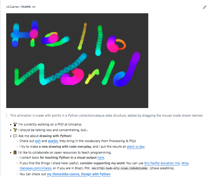
#Python is for artists too!
I made some #Python #numpy, #shapely, #trimesh & #py5bot stickers!
PS: I asked the PSF to check if the logos were alright: “you can change the colors and add thing inside, but not change the shape or position of the snakes”. So I had to change my original Python reading club logo…
#Python is for artists too!
I made some #Python #numpy, #shapely, #trimesh & #py5 stickers!
PS: I asked the PSF to check if the logos were alright: “you can change the colors and add elements inside, but not change the shape or position of the snakes”. So I had to change my original Python Reading Club logo…
Does anyone know of an OsmAnd rendering style that resembles OpenCycleMap? It should highlight cycle networks with vibrant colors and fade everything else. Currently, I plan bike tours by first opening OpenCycleMap on my PC to get an idea and then using OsmAnd on my phone to actually plan the tour. Ideally, I would just use OsmAnd. ⌘ Read more
#MaradoWeekly #WeeklyPlant Week 37
What a crazy color temperature this yellow orange was in person! Sick lighting this evening: https://lyse.isobeef.org/abendhimmel-2025-09-15/
We just had some lovely colors again: https://lyse.isobeef.org/abendhimmel-2025-09-12/
↳
In-reply-to
»
Lunar eclipse just now: https://movq.de/v/f377c108cb
⤋ Read More
@movq@www.uninformativ.de Somebody knew what he was doing, great shots! Also, quite interesting to see the color and brightness change.
↳
In-reply-to
»
Not too shabby: https://lyse.isobeef.org/abendhimmel-2025-08-28/
⤋ Read More
@lyse@lyse.isobeef.org Very nice colors dude! 😅
I’ve got a prototype of my hardcopy simulator going. I’m typing on the keyboard and the “display” goes to the printer:
https://movq.de/v/235c1eabac/MVI_8810.MOV.mp4
The biiiiiiiiiig problem is that the print head and plastic cover make it impossible to see what’s currently being printed, because this is not a typewriter. This means: In order to see what I just entered, I have to feed the paper back and forth and back and forth … it’s not ideal.
I got that idea of moving back/forth from Drew DeVault, who – as it turned out – did something similar a few years back. (I tried hard to read as little as possible of his blog post, because figuring things out myself is more fun. But that could mean I missed a great idea here or there.)
But hey, at least this is running on my Pentium 133 on SuSE Linux 6.4, printer connected with a parallel cable. 😍
(Also, yes, you can see the printouts of earlier tests and, yes, I used ed(1) wrong at one point. 🤪 And ls insisted on using colors …)
Dear @doctormo@doctormo, I’m a great admirer of your work in general and hopefully I won’t creep you out by telling everyone I’m your fan!
As a creator of digital vector-based art I find the color management stuff (trying to figure how to generate things to print “in CMYK”) mind boggling. I slowly try to read and acquire the concepts and vocabulary to understand more about this. I’m grateful for your work in this area. Thank you!
↳
In-reply-to
»
We went out an hour earlier to escape the rain. But we got drizzled on, nevertheless. As expected, the rain jacket was finally wet on both the out- and inside. Sweating under that plasic layer is unavoidable with these temperatures. It was still a very nice walk and great vibe with the gray soup. Just right. :-)
⤋ Read More
Surprisingly, the sky got quite some lovely colors this evening. I approve! https://lyse.isobeef.org/abendhimmel-2025-08-21/
↳
In-reply-to
»
Speaking of manpages:
⤋ Read More
You can explicitly use colors in manpages. I saw this in the apt manpage of Ubuntu recently, which, for some reason, uses blue text in one place:
Makes little sense to me. I’m glad that most manpages don’t do this. I wouldn’t want unicorn vomit all over the place.
Using colors can be done using the low level commands \m and \M:
.TH foo_program 3
\m[blue]I'm blue\m[], da ba dee.
\m[red]\M[yellow]I'm red on yellow.\m[]\M[]
This is quite horrible.
↳
In-reply-to
»
Speaking of manpages:
⤋ Read More
@kat@yarn.girlonthemoon.xyz On the one hand, all these programs have a very long history and the technology behind manpages is actually very powerful – you can use it to write books:
https://www.troff.org/pubs.html
I have two books from that list, for example “The UNIX programming environment”:
It’s a bit older, of course, but it looks and feels like a normal book, and it uses the same tech as manpages – which I think is really cool. 😎
It’s comparable to LaTeX (just harder/different to use) but much faster than LaTeX. You can also do stuff like render manpages as a PDF (man -Tpdf cp >cp.pdf) or as an HTML file (man -Thtml cp >cp.html). I think I once made slides for a talk this way.
On the other hand, traditional manpages (i.e., ones that are not written in mandoc) do not use semantic markup. They literally say, “this text is bold, that text over here is italics”, and so on.
So when you run man foo, it has no other choice but to show it in black, white, bold, underline – showing it in color would be wrong, because that’s not what the source code of that manpage says.
Colorizing them is a hack, to be honest. You’re not meant to do this. (The devs actually broke this by accident recently. They themselves aren’t really aware that people use colors.)
If mandoc and semantic markup was more commonly used, I think it would be easier to convince the devs to add proper customizable colors.
↳
In-reply-to
»
Speaking of manpages:
⤋ Read More
@lyse@lyse.isobeef.org @kat@yarn.girlonthemoon.xyz Colorized manpages have been a thing for a very long time:
Problem is, hardly anybody knows this, because you configure this by … drumroll … overwriting TERMCAP entries of less in your ~/.bashrc:
export LESS_TERMCAP_md=$'\e[38;5;3m'      # Bold
    export LESS_TERMCAP_me=$'\e[0m'           # End Bold
export LESS_TERMCAP_us=$'\e[4;38;5;6m'    # Underline
    export LESS_TERMCAP_ue=$'\e[0m'           # End Underline
export GROFF_NO_SGR=1                     # Needed since groff 1.23
↳
In-reply-to
»
Speaking of manpages:
⤋ Read More
@movq@www.uninformativ.de @kat@yarn.girlonthemoon.xyz I also wondered for a very long time why nobody improved the man experience in the terminal. I’d love to see links and more colors.
Stuff that nobody needs:
systemctl uses ANSI escape codes to underline text (\e[4m) and then it also uses special escape codes – that Wikipedia classifies as “not in the standard”, but I haven’t looked it up – to change the color of the underline. That color change is barely noticeable in the first place.
Some terminals don’t support this and now my systemctl output is blinking because of that.
↳
In-reply-to
»
I was drafting support for showing “application icons” in my window manager, i.e. the Firefox icon in the titlebar:
⤋ Read More
@lyse@lyse.isobeef.org Oh, huh, maybe it was just my GNOME 2 themes back then that didn’t show the icon. 🤔
I like the looks of your window manager. That’s using Wayland, right?
Oh, no. It’s still X11. All my recent Wayland comments resulted from me trying to switch, but I think it’s still too early. Being unable to use QEMU (because it can’t capture the mouse pointer) is a pretty big blocker for me. This is completely broken, it just happens to be unnoticeable with modern guest OSes, so it’s probably not a priority for devs.
(Not to mention that I would have to fork and substantially extend dwl in order to “replicate” my X11 WM. And then, after having done that, I’d have to follow upstream Wayland development, for which I don’t have the resources. Things would need to slow down before I can do that.)
all that wasted space of the windows not making use of the full screen!!!1
Heh. I’ve been using tiling WMs for ~15 years now, so it’s actually kind of refreshing to see something different for a change. 😅
Probably close to the older Windowses.
That particular theme is a ripoff of OS/2 Warp 3:
😅We ran some similar brownish color scheme (don’t recall its name) on Win95 or Win98
Oh god. Yeah, I wasn’t a fan of those, either. 🥴
↳
In-reply-to
»
I was drafting support for showing “application icons” in my window manager, i.e. the Firefox icon in the titlebar:
⤋ Read More
@movq@www.uninformativ.de According to this screenshot, KDE still shows good old application icons:
And GNOME used to have them, too:
I like the looks of your window manager. That’s using Wayland, right? The only thing on this screenshot to critique is all that wasted space of the windows not making use of the full screen!!!1 At least the file browser. 8-)
This drives me nuts when my workmates share their screens. I really don’t get it how people can work like that. You can’t even read the whole line in the IDE or log viewer with all the expanded side bars. And then there’s 200 pixels on the left and another 300 pixels on the right where the desktop wallpaper shows. Gnaa! There’s the other extreme end when somebody shares their ultra wide screen and I just have a “regularish” 16:10 monitor and don’t see shit, because it’s resized way too tiny to fit my width. Good times. :-D
Sorry for going off on a tangent here. :-) Back to your WM: It has the right mix of being subtle and still similar to motif. Probably close to the older Windowses. My memory doesn’t serve me well, but I think they actually got it fairly good in my opinion. Your purple active window title looks killer. It just fits so well. This brown one (
) gives me also classic vibes. Awww. We ran some similar brownish color scheme (don’t recall its name) on Win95 or Win98 for some time on the family computer. I remember other people visting us not liking these colors. :-DFolks, another unicorn vomited in our sky tonight: https://lyse.isobeef.org/abendhimmel-2025-07-19/
We covered quite some ground in the two and a half hours today. The weather was nice, mostly cloudy and just 23°C. That’s also why we decided to take a longer tour. We saw four deer in the wild, three of which I managed to just ban on film, quality could be better, though. My camera produced a hell lot of defocused photos this time. Not sure what’s going on with the autofocus. https://lyse.isobeef.org/waldspaziergang-2025-07-10/
When the sun came out, colors were just beautiful:
We got some colorful spots in the sky this evening: https://lyse.isobeef.org/abendhimmel-2025-07-08/
↳
In-reply-to
»
The lack of suckless-like simple, hackable software these days is appalling.
⤋ Read More
@prologic@twtxt.net Yeah, this really could use a proper definition or a “manifest”. 😅 Many of these ideas are not very wide spread. And I haven’t come across similar projects in all these years.
Let’s take the farbfeld image format as an example again. I think this captures the “spirit” quite well, because this isn’t even about code.
This is the entire farbfeld spec:
farbfeld is a lossless image format which is easy to parse, pipe and compress. It has the following format:

╔════════╤═════════════════════════════════════════════════════════╗
║ Bytes  │ Description                                             ║
╠════════╪═════════════════════════════════════════════════════════╣
║ 8      │ "farbfeld" magic value                                  ║
╟────────┼─────────────────────────────────────────────────────────╢
║ 4      │ 32-Bit BE unsigned integer (width)                      ║
╟────────┼─────────────────────────────────────────────────────────╢
║ 4      │ 32-Bit BE unsigned integer (height)                     ║
╟────────┼─────────────────────────────────────────────────────────╢
║ [2222] │ 4x16-Bit BE unsigned integers [RGBA] / pixel, row-major ║
╚════════╧═════════════════════════════════════════════════════════╝

The RGB-data should be sRGB for best interoperability and not alpha-premultiplied.
(Now, I don’t know if your screen reader can work with this. Let me know if it doesn’t.)
I think these are some of the properties worth mentioning:
- The spec is extremely short. You can read this in under a minute and fully understand it. That alone is gold.
- There are no “knobs”: It’s just a single version, it’s not like there’s also an 8-bit color depth version and one for 16-bit and one for extra large images and one that supports layers and so on. This makes it much easier to implement a fully compliant program.
- Despite being so simple, it’s useful. I’ve used it in various programs, like my window manager, my status bars, some toy programs like “tuxeyes” (an Xeyes variant), or Advent of Code.
- The format does not include compression because it doesn’t need to. Just use something like bzip2 to get file sizes similar to PNG.
- It doesn’t cover every use case under the sun, but it does cover the most important ones (imho). They have discussed using something other than RGBA and decided it’s not worth the trouble.
- They refrained from adding extra baggage like metadata. It would have needlessly complicated things.
↳
In-reply-to
»
Just discovered how easy it is to recall my last arg in shell and my brain went 🤯 How come I've never learned about this before!? I wonder how many other QOL shortcuts I'm missing on 🥲
⤋ Read More
@aelaraji@aelaraji.com Oh, that’s great! I haven’t heard about any of them before either. There’s also a caveat though, that I ran right into the very first time I tried this in zsh:
$ ls > /dev/null
$ echo $_
--color=tty
Yeah, exactly what you think:
$ which ls
ls: aliased to ls --color=tty
Alt+. is going to be my favorite one! In the above, it would also give me /dev/null, which might be probably more what I would expect.
i ordered some fun colorful new minidiscs so i can finally get back to recording my mixes :D looking forward to it
↳
In-reply-to
»
@lyse those are pretty cool! The one change I would recommend doing pronto is the colour of the hyperlinks. Ay, ay, ay, my retina! :-P
⤋ Read More
@quark@ferengi.one Ta. Hmm, what’s wrong with the blue text color? Is it too dark on the black background for you? :-?
Normal links are blue while images are teal. I thought I differentiate the two if I easily can. The underline of URLs comes from my terminal and is not tt’s fault.
Configuring colors is in the todo list. But of course, providing a sane default is definitely something I’d like to have.
Once again, I went on a hike onto my backyard mountain after calling it quits very late. This time I brought my cam along. The view was extremely hazy, but the setting sunlight resulted in cool colors. The freshly cut grass smelled wonderful.
I saw a flock of pidgeons circling around and some sort of rat or mouse quickly running over the road in front of me from one field into the next one with a giant nut in its mouth. Or so I at least believe, couldn’t really tell, it happened so fast.
A couple enjoyed the setting sun on a bench and stripped their shoes on this warm evening. Somebody forget their bottle of water on the summit, but it looked rather cool in the evening light:
Not sure what they’re doing, but they now set up scaffolding at the ruin. I heavily doubt it, but it would be cool if they rebuilt the castle. :-)
On the way back I met up with a mate who couldn’t come along right from the beginning. We saw two deer on the meadow, but it was already too dark for my camera, the photos were totally rubbish. The sunset turned really pretty and colorful just in time when I reached home. https://lyse.isobeef.org/waldspaziergang-2025-06-10/
↳
In-reply-to
»
@lyse Oooooh, never seen that before. 😲 Either white-balance doing funny stuff or unusual “filtering” through those clouds. 🤔
⤋ Read More
@movq@www.uninformativ.de Very rarely does it happen. Yup, the clouds are to praise for today’s spectacle. Surpringly, the pink is fairly close to how it actually looked in person. I was pleased to see that. The neon orange in front of the grayish sky was way cooler, though. I wish I could close the aperture on my camera in the hope of capturing the insane color. Oh well.
Deals: M4 MacBook Air for $812! MacBook Pro 16″ M4 Max 48GB/1TB for $3440, & More
Amazon isn’t letting up on the great deals, with the M4 Macbook Air 13″ model now being offered at just $812 for the base 13″ model with 16GB RAM, 256GB SSD, and Midnight color. You can also get great deals on other colors, but the cheapest by far is the dark Midnight color at the … [Read More](https://osxdaily.com/2025/06/03/deals-m4-macbook-air-for-812-macbook-pro-16 … ⌘ Read more
Deals: Up to $198 Off M4 MacBook Air in 13″ & 15″
Amazon is offering nice discounts on the M4 MacBook Air series, in either the 13″ or 15″ screen sizes. You’ll find the best deal on the 24GB RAM models ($198 off the 24GB / 512GB model in 13″!), but there are discounts available on all memory/storage configurations and color options (Sky Blue, Midnight, Starlight, Silver). … Read More ⌘ Read more
10 Ancient “Smart” Materials Scientists Still Can’t Reproduce
As civilizations from Rome to the Maya harnessed empirical ingenuity to create materials with built-in healing, color-shifting, or structural resilience, they left behind recipes that modern science is only now decoding. From rust-proof iron pillars and self-repairing concrete to nanotech-level glass and ancient vulcanized rubber, these ten remarkable “smart” materials demonstrate how our ancestors engineered […] … ⌘ Read more
Deals: iPad mini 7 for $399
iPad mini 7 is a powerful miniature tablet that features the A17 processor with Apple Intelligence support, 8″ LCD display, a 12mp front and rear camera, 128 GB storage, USB-C charging, and support for optional Apple Pencil Pro. iPad mini is offered in multiple color options at this 20% discount price, taking $100 off the … Read More ⌘ Read more
10 Times Governments Banned Colors for Bizarre Reasons
When we think of banned things, we tend to imagine books, political speech, or the occasional controversial cartoon. But throughout history, governments have cracked down on something far stranger: colors. Whether tied to class, ideology, or sheer paranoia, certain shades have been restricted, outlawed, or made dangerous to wear—all because they said too much without […]
The post [10 Times Governments Banned Colors for Biz … ⌘ Read more
Once again, we had some very beautiful colors this evening: https://lyse.isobeef.org/abendhimmel-2025-05-16/
Get the iPad Mini 7 for $399.99 at Amazon This Week ($99 Off)
Amazon this week is providing record low prices on multiple models of the iPad mini 7, starting at $399.99 for the 128GB Wi-Fi tablet, down from $499.00. Colors on sale at this price include Purple, Space Gray, and Blue.
. The M4 MacBook Air features an M4 chip with Apple Intelligence support, LCD display in 13″ … Read More ⌘ Read more
Forgot to post these here: A bunch of Mandelbrot images using the trans, ace, and aro color palettes.
More and full res PNGs:
Powerbeats Pro 2 Available for Lowest Ever Price of $199.95, Plus Beats Pill at $99.95 and More
Amazon this weekend is discounting a collection of Beats headphones and speakers, including an all-time low price on the Powerbeats Pro 2. You can get this new 2025 model for $199.95 in all four colors, down from $249.99.

⤋ Read More
Love all the funky colors though 😎
Amazon Takes $100 Off iPad Mini 7 With Return of All-Time Low Prices, Starting at $399
Amazon this weekend is providing record low prices on multiple models of the iPad mini 7, starting at $399.00 for the 128GB Wi-Fi tablet, down from $499.00. Colors on sale at this price include Purple, Space Gray, and Starlight.
Amazon Has Every M4 MacBook Air on Sale for Up to $165 Off This Weekend
Amazon this weekend has record low prices across the entire M4 MacBook Air lineup, with up to $165 off every model in every color.
↳
In-reply-to
»
Once or twice a year, I make an effort to switch from dark mode / black terminals to light mode again.
⤋ Read More
I’m keeping this color scheme on my laptop for now:
Why did Windows 7, for a few months, log on slower if you have a solid color background?
Comments ⌘ Read more
Deals: Save $100 on New M4 MacBook Air
Amazon is offering up to $102 off the price of the brand new M4 MacBook Air series in select configurations and color options, in both 13″ and 15″ display sizes. The M4 series MacBook Air features an M4 chip with Apple Intelligence support, a Liquid Retina LCD display, 12MP camera with Center Stage, Touch ID, … Read More ⌘ Read more
Istio publishes results of ztunnel security audit
Passes with flying colors Istio’s ambient mode splits the service mesh into two distinct layers: Layer 7 processing (the “waypoint proxy”), which remains powered by the traditional Envoy proxy; and a secure overlay (the “zero-trust tunnel”… ⌘ Read more
Video Review: The AirPods Max in 2025
Apple hasn’t introduced a major update for the AirPods Max since the headphones came out in 2020, but last year there was a minor refresh with new color options and an upgrade to USB-C charging. With no additional new features on the horizon, we thought we’d take a look at whether the AirPods Max are worth picking up in 2025.
_[Subscribe to the MacRumors YouTube channel](https://www.youtube.com/user/macrumors?sub_con … ⌘ Read more
trying to not feel stressed today, so I digitally colored a smol frog that says fuck terfs! >m< i have no idea if I did that right bc it’s my first time using yarn to post an image so rip to me if I messed that up :’D
↳
In-reply-to
»
Setting custom primary and secondary colours isn’t working. I tried “red” for first, and “orange” for second. Didn’t work.
⤋ Read More
@bender@twtxt.net Shall we remove this primary/secondary color sttting? 🧐
(#kdd6jea) @bender@bender Shall we remove this primary/secondary color sttting? 🧐
@bender @twtxt.net Shall we remove this primary/secondary color sttting? 🧐 ⌘ Read more
10 Psychological Tricks Brands Use to Influence You
You’re not just buying a product—you’re stepping into a carefully crafted psychological trap. Modern brands work with behavioral economists, neuro marketers, and data scientists to make sure everything—from colors to prices to your choices—leads you exactly where they want. These aren’t generic marketing clichés—these are real, specific strategies currently being used to win your attention, […]
The post [10 Psychological Tricks … ⌘ Read more
Amazon Discounts USB-C AirPods Max to $479.99 ($69 Off)
Amazon today has the USB-C AirPods Max on sale for $479.99 in every color, down from $549.00. This beats the price we tracked last week by about $20, and it’s an overall second-best price on the headphones.
Another nice stroll in nature last week: https://lyse.isobeef.org/waldspaziergang-2025-04-03/
iPhone 17 Pro’s New Rear Camera Bar ‘Same Color As Rest of Device’
Apple’s upcoming iPhone 17 Pro models will feature a redesigned rear camera module that spans the width of the device, but it will be the same color as the iPhone itself, rather than being part of a two-tone design.
MacRumors render showing the two-tone design that Gurman has ruled out
That’s according to [Bloomberg’s Mark Gurman]( … ⌘ Read more
↳
In-reply-to
»
There's a secret art easter egg thing, hidden on my website ( https://thecanine.ueuo.com ), for this years April fools event - it's been there for a few weeks, but now I can finally give hints.
⤋ Read More
@lyse@lyse.isobeef.org you must be loved by all the web developers in town! But ok, I have added all the missing semicolons, that should technically be there, but them not being there, does not make a difference.
Font color change inside every summary element, was a very deliberate choice, to color the text, but leave the arrow black (same as website background). But ok, I rewrote the CSS to hide the arrows and make all summaries white - since this also works better, with some dark theme enforcing browser extensions.
HOWEVER “p” as a child element of “summary” is a thing, that as far as I know, all browsers respect and if a font color is applied only once, I don’t think it matters, if it’s done through HTML or CSS, you smart ass.
↳
In-reply-to
»
There's a secret art easter egg thing, hidden on my website ( https://thecanine.ueuo.com ), for this years April fools event - it's been there for a few weeks, but now I can finally give hints.
⤋ Read More
@thecanine@twtxt.net I found it! This looks like colored easter eggs when squinting.
iOS 18.4 Expected Next Week - Here Are the Release Notes
With the second release candidate of iOS 18.4 that Apple seeded out today, the company finally provided us with release notes that give a full rundown on what to expect.
There’s an Apple Vision Pro app, new Apple Intelligence featur … ⌘ Read more
10 OCD Themes That Are Not About Cleanliness
Obsessive-compulsive disorder (OCD) is a “mental health condition where distressing, intrusive thoughts (obsessions) trigger repetitive behaviors (compulsions) aimed at reducing anxiety or preventing something bad from occurring.” When most people think of OCD, they think of orderliness, cleanliness, color-coded closets, pristine lists, and grouping your Skittles into colors before eating them. Television and movies like […]
The post [10 OCD … ⌘ Read more
golang 每日一庫之 fatih-color
fatih/color 是一個流行的 Go 語言庫,用於在終端中輸出彩色文本和樣式化的內容。由開發者 Fatih Arslan 創建,它簡化了 ANSI 轉義碼的使用,使開發者能夠輕鬆爲 CLI 工具、日誌系統等添加顏色和樣式。特點豐富的顏色和樣式支持 顏色 :支持 16 種基礎前景色(如紅色、綠色)和背景色。 樣式 :支持加粗(bold)、斜體(itali ⌘ Read more
UNIHIKER K10 is an ESP32-S3 based platform with TinyML and built-in sensors
The UNIHIKER K10 is an AI learning device designed for education, integrating features for artificial intelligence, machine learning, and IoT applications. It includes a 2.8″ color screen, Wi-Fi, Bluetooth, a camera, microphone, speaker, RGB light, and multiple sensors. The device features an ESP32-S3 Xtensa LX7 microcontroller with 512KB SRAM and 16MB flash storage. It supports […] ⌘ Read more
Apple Says New MacBook Air Up to 23x Faster Than Intel-Based Model, But Read the Fine Print
Apple has a staggering marketing claim for the new MacBook Air with the M4 chip.
Specifically, Apple [says](https://www.apple.com/newsroom/2025/03/apple-introduces-the-new-macbook-air-with-the-m4-chip-and-a-sky-b … ⌘ Read more