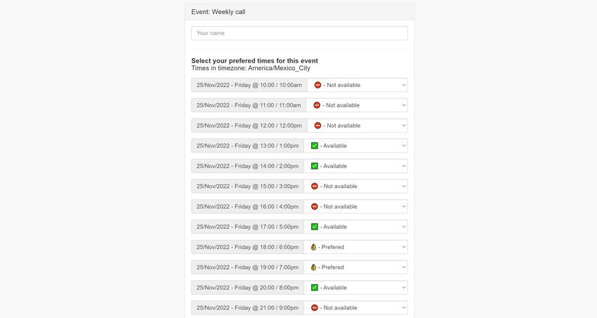
I’m working on this PoC to vote on the best time for an international call, showing the multiple timeslots in your local time, and getting numbers on preferences among people.
The UI could be vastly improved, but this is what I have so far… I want to see it in action since it’s very different to choose between 1, 2, or even 7 days (24 hours each). If you want to help to test it and give some comments send me a reply!

At least I’m learning a lot on the topicβ€¦πŸ˜

Screenshot
Download

Screenshot

​ Read More

@eaplmx@twtxt.net look good, great work. I’m getting a bit confused with the icons, especially the colours. If preferred is to be above available the the colour should be flipped so preferred is green and available is yellow similar to a traffic light 🚦

Doodle.com uses (βœ“) for their middle level called something like yes if needed vs just βœ“ for yes

​ Read More

Participate

Login to join in on this yarn.