Hi everyone!
Put my hands on the issue yarn#647.
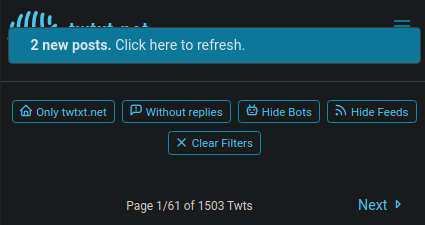
Here a preview:
Desktop:

Mobile:

PS: @prologic@twtxt.net How the f*ck do you generate Upload Media hashes???? Look at the mobile image URL! 🤣🤣🤣🤣🤣🤣🤣🤣🤣
Hi everyone!
Put my hands on the issue yarn#647.
Here a preview:
Desktop:

Mobile:

PS: @prologic@twtxt.net How the f*ck do you generate Upload Media hashes???? Look at the mobile image URL! 🤣🤣🤣🤣🤣🤣🤣🤣🤣
@bender@twtxt.net Actually, it was centered at first, but I expanded it to look more like the proposed version.
About the icon, I thought about it too.
I’d like to reuse the current iconset but I think it was cleaned to keep only the currently used icons, a refresh icon might be missing right now.
@justamoment@twtxt.net LOL 🤣 uuid 😆
This looks nice 👌 Now we just gotta tie it up to the backend 😅
@prologic@twtxt.net nice 👍
With a new day comes new fixes! 😎
Added more controls and, thanks to @bender@twtxt.net advices, some visual adjustments.
Details on what changed here.
Desktop:

Mobile:

Hope it’s to your tastes! 😋
So cool! 👌 Gotta try and get through my notifications today and wire this up 🤞
@bender@twtxt.net Good point, like on Facebook where you simply click on it and it scrolls back to the top (Don’t know if it’s still like that, I don’t use it).
Do you, or anyone else, have some other tips to improve it?