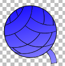
test gradient for the logo, still need to vectorise the image and remove the background @prologic@twtxt.net
@fox@twtxt.net Hey this is looking pretty cool 😎 cc @fastidious@arrakis.netbros.com @lyse@lyse.isobeef.org
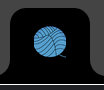
@fastidious@arrakis.netbros.com It is for Yarn.social’s landing page and default Pod logo. We will try to match existing colors as best we can, but if you have any ideas, please speak up 😅 – The idea in general is to actually make all the logo/colors and branding consistent. The logo especially (look in assets) is horribly inconsistent 😂
One thing that can be done is to have two versions of the logo. One that is colored, to be used primarily on posters, landing page, and app launcher / favicon and the other to be the default pod logo. That way the “structure” is consistent at least but we remain consistent with the default theme too 👌 Essentially:

@prologic@twtxt.net I see. On an SVG you can match, by just little it fill. That is the way it is right now. Now, if you set gradients, I am not sure how will that work. I agree the logo on assets looks like drawn by a child 😂. Nothing wrong with that; children can be quite art experts, but, yeah, you are right.