Hmmm…
Go instead to the lower limit of Miller’s Law (about having 7 +/- 2 options)
That means max 5 elements.

Hmmm…
Go instead to the lower limit of Miller’s Law (about having 7 +/- 2 options)
That means max 5 elements.

@prologic@twtxt.net maybe going to a tri-state selection can help a lot.
When you pick a filter it loop through this:
This adds flexibility and compress the filters in one go.
@prologic@twtxt.net I guess you can do it?
I think a filter=yes/no/none should cover the states.
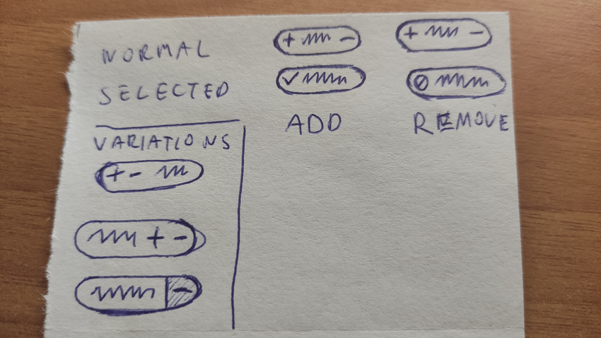
For the UI I can probably help, I think a Chip style design could work… 🤔
@justamoment@twtxt.net Chip style design? What’s that? intrigued 🧐
@eaplmx@twtxt.net something like this I guess?

This style would also be good for wrapping on mobile with display: inline-block or flexbox.
I would suggest putteing the filters in a sidebar. With simple.css we can already use <aside> for this and from the new tabs in settings we can reuse the style for getting the boxes
Something like this:
<main class="container float">
<aside class="filternav">
<h4>Filters</h4>
<nav class="tabs">
<a href="https://twtxt.net/?f=localonly" class="current">On twtxt.net</a>
<a href="https://twtxt.net/?f=noreplies">No Replies</a>
<a href="https://twtxt.net/?f=nobots">Exclude Bots</a>
<a href="https://twtxt.net/?f=norss">Exclude Feeds</a>
<a href="https://twtxt.net/">Clear</a>
</nav>
</aside>
@darch@neotxt.dk Looks amazing! I’d only add the checkmark from my previous image or any other way to know if something is toggled on or off. At first sight it’s difficult to know if On twtxt.net is on or off.
In terms of a11y, I have never done that, I guess instead of <a> it could be styled checkboxes due to the on-off nature.
More info here: https://www.a11ymatters.com/pattern/checkbox/
@eaplmx@texto-plano.xyz good idea to use check boxes, but not sure how to make it work…
@darch@neotxt.dk @prologic@twtxt.net is there any way to remove @~eaplmx@texto-plano.xyz (texto-plano)? It’s a ‘dead’ twtxt currently. I only use @eaplmx@twtxt.net (English) and me@eapl.mx (Spanish)
@darch@neotxt.dk Here is an example: https://codepen.io/quinlo/pen/ReMRXz
Found here: https://www.sliderrevolution.com/resources/css-checkbox/
@eaplmx@twtxt.net tooo.muutch.animaaation but otherwise cool
@darch@neotxt.dk good ideas for the side bar.
@eaplmx@twtxt.net your example is nice but it doesn’t cover the “exclude” part.
Also I don’t see them as checkboxes but more as a navigation option.
I’ll try something later myself when on my PC.
@prologic@twtxt.net it’s just an interactive mock but if uses link for the actual actions, that means you can use it on the backend.
Does this style makes sense for a tri-state filter?
@prologic@twtxt.net I used nopaste, this service let you share without storing anything anywhere, that means everything is in the URL, you probably have the query params stripping in your settings.