@prologic@twtxt.net when I log in to my old account on twtxt.net it looks like this:
Behold! My Raspberrry Pi 3 Model B
@prologic@twtxt.net Zuckerberg crying in the Metaverse™

I’ve started working on the UI/UX of Yarn Search
But I would agree with @quark@ferengi.one that the fuzzy search is a bit too fuzzy when darch gives hits likes March
@prologic@twtxt.net sure when I will go to bed yet…
@quark@ferengi.one try switching to query string under options
@prologic@twtxt.net here’s a crude mock-up of a search interface
@xuu@txt.sour.is Well, it took me like 4 hours to set up, implement and test the PHP library, with all the setup combinations, devices and such.

So I’ll say that using a password with a simple function like https://www.php.net/manual/en/function.password-verify.php
is much easier than a whole library requiring communication between the server, the browser and the auth device… There is a security reason for that (mainly to avoid phishing, which is something I like compared to other solutions like SQRL)

@prologic@twtxt.net Nice!

#bug Anyone else noticed that clicking on Bookmarks or Mute make the icon disappear?
I belive it was cause by the CSS changes I made in yesterdays PR, which have already been merged to main, but trying to roll back the change does not seem to fix it, so it might have been ther for some time.
Will others please test on their pods and report back here?
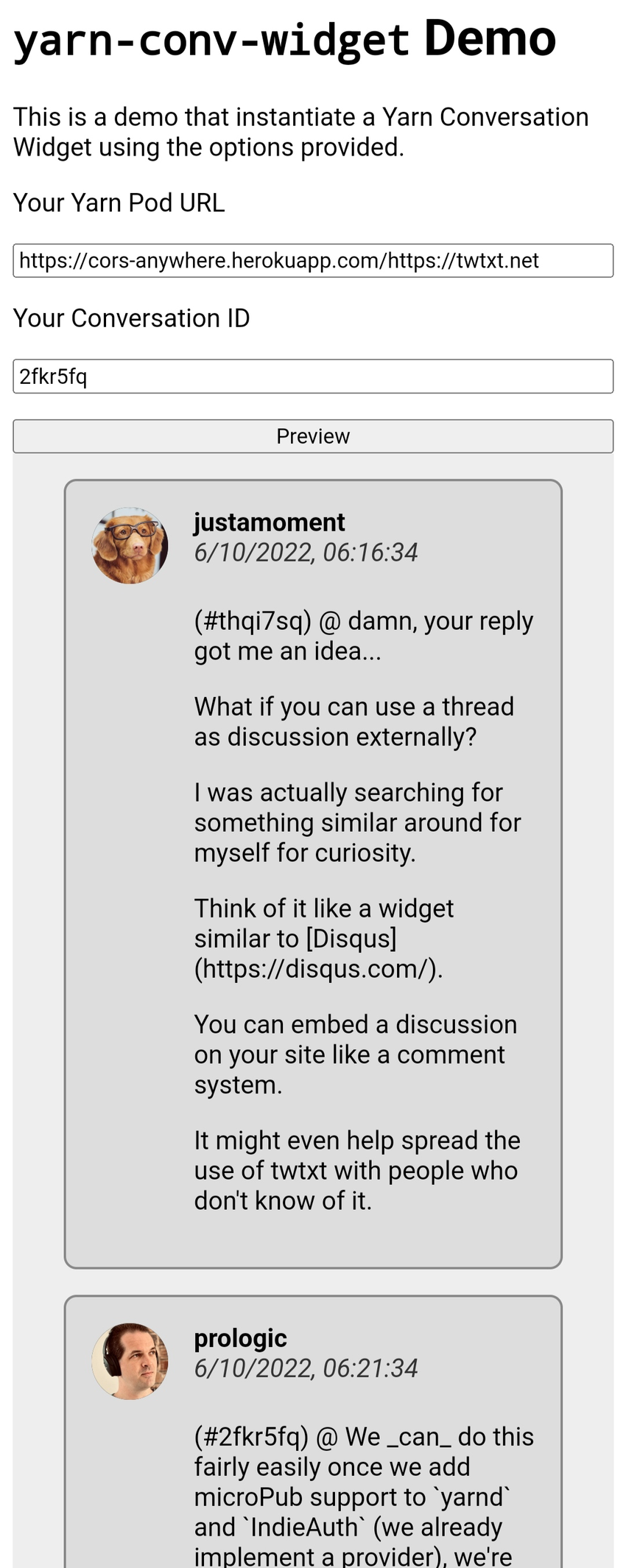
Published without the link, here again: https://git.mills.io/justamoment/yarn-conv-widget
Live demo: https://sunetraalex.gitlab.io/yarn-conv-widget/
Note: you might want to try with a proxy since CORS is not enabled, like I did in the screenshot below.
@stigatle@yarn.stigatle.no are you on your own pod? If you upgrade to the latest version of yarn from source it should look like this:
You can also change it by targeting the element using the Custom CSS field, but I have also been thinking to change the colors myself in the new theme based on SimpleCSS
@prologic@twtxt.net Mario, the plumber!
What have you been doing for the last 5 years? 😛

@prologic@twtxt.net it’s a nice one, similar to Mario Odyssey

@prologic@twtxt.net Ok, I tried with your server and it seems to work. I should try with my server (which has the newest version of Go), but that will be later this week

@movq@uninformativ.de Stupid sexy money

@akoizumi@social.kyoko-project.wer.ee Did you use “Trace Bitmap”?
The resolution is a bit too small but I tried myself and the result is not bad.
I took a screenshot with the options i used, hope it helps.
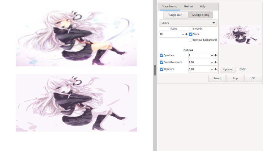
The image below is the vector generated.
@prologic@twtxt.net the fix is live now on neotxt.dk. let me know how it looks at your end?
@prologic@twtxt.net Allready did that, because I found it confusing too:
@akoizumi@social.kyoko-project.wer.ee How does it look when you inspect the site?
For people born after the 90s (no one here I suppose), this was Active Desktop:

Instead of a static image, show a Dynamic Web page refreshed every X minutes. Good memories of the old .com web portals of that age
Active Desktop 😅
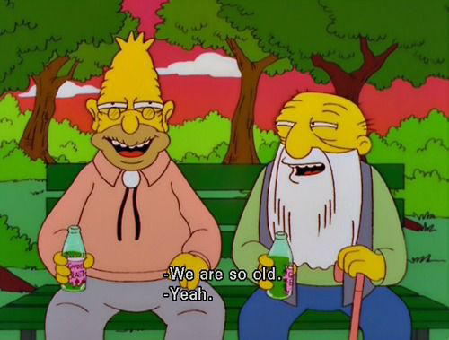
@mckinley@twtxt.net It looks like this over here
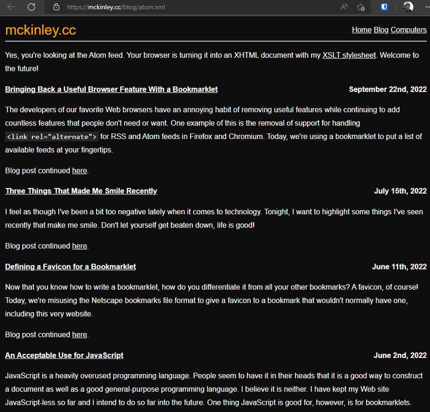
@eaplmx@twtxt.net they are only visible in my custom theme on neotxt.dk, but if you hover the icons on twtxt.net you should see the times as well
@tkanos@twtxt.net like this?
Seem we are missing the reply to treads that you have started, but where people have not necessary mentioned you in - great idea to have that too:)
Idea for new purple(ish) color scheme for yarn.social’s visual identity base on the html/css colors named SlateBlue and SeaGreen
@eaplmx@twtxt.net To reply to a message or tread you add the hash-tag from the URL of the message your want to reply to in parentheses to the beginning of your message.
For this conversation or tread it would be DATETIME your reply here...
@akoizumi@social.kyoko-project.wer.ee it not gone here:
Signal Desktop is gone https://cdn.nuegia.net/29a006d8-27e4-403a-a848-7c2d23c3c4c9/psishare-MgnFrG.png
I believe I have fixed what I found of issues on the main pages, so theme_simpleCSS should be ready for daily use and a merge with main soon.
One big change is that the Custom Secondary Color under Settings now control the icons and inline-code instead of Hover/Select Color as before
@mckinley@twtxt.net Is this what you were asking for?
I have been hacking away on replacing the PicoCSS with Simple.css, since it offer a much manageable set of color variables that can ease the work of making your own team a whole lot.
I have gotten to a place now with some sane default colors, so you are welcome to take it for a spin from: https://git.mills.io/yarnsocial/yarn/src/branch/theme_simpleCSS
There are still some issues with the mobile menu and some side-effects of using headers in places it should not have been used in the first place.
Please let me know if this is something that you see worthy of being merged into main and what you like or dislike about it as it stands now.
Grab Clone App On-Demand Multi Service App 2022
A white-labeled multi service platform with Grab Clone App. Build your taxi business, delivery business or more on demand services. Grab clone script has smart mobile aaps, fantastic admin panels and dynamic website.
wew
YUCK


